ProLiteracy

Leading the advancement of adult literacy in the US and throughout the world
ProLiteracy builds the capacity of adult literacy programs to transform lives and communities. As a proven leader in their field for over 60 years, they needed an updated brand and website to demonstrate their expertise as a convener in adult education, showcase their partnerships and resources, and communicate their one-of-a-kind program and publishing model.
Logo and Visual Identity
A brand designed around the evolution of literacy
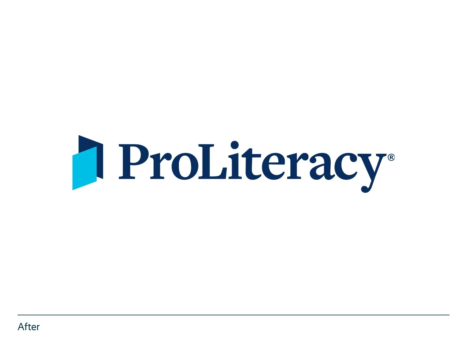
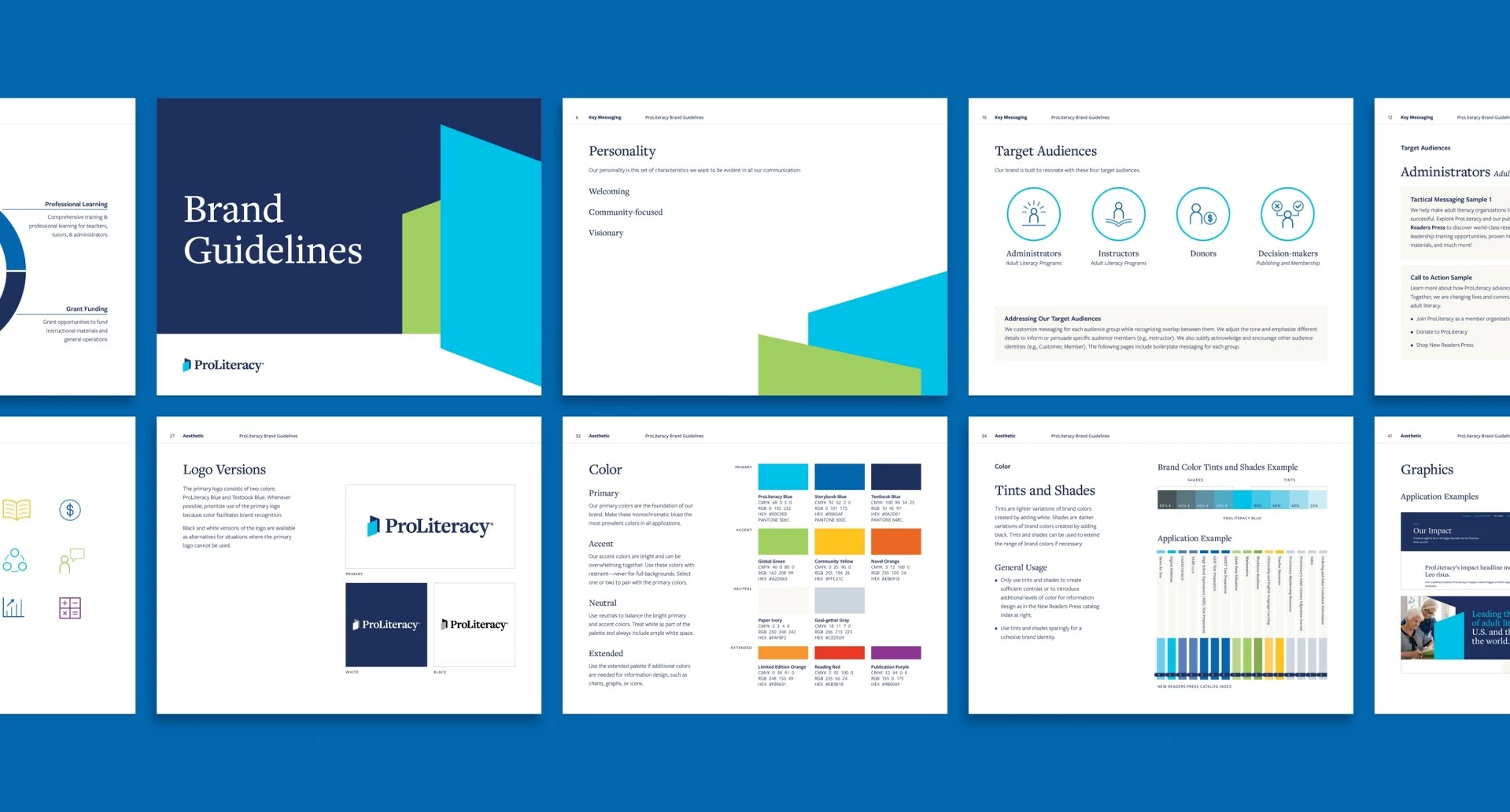
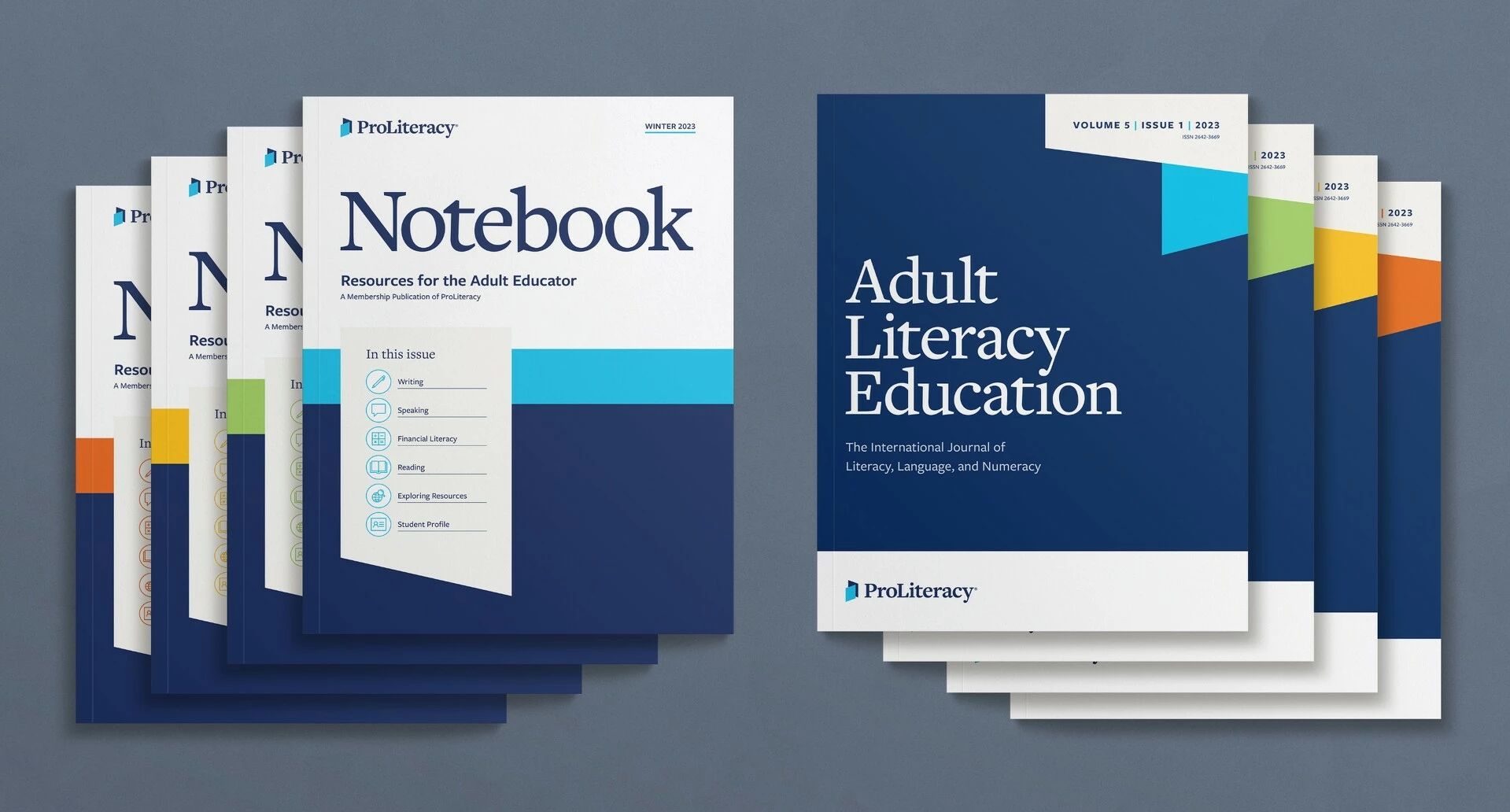
ProLiteracy needed an updated logo in step with the digital evolution of their field. The new logo is a versatile symbol, resembling a piece of paper, tablet, phone, book, or arrow. The bold, geometric shapes of the logo form the basis of the brand’s entire visual identity. Vibrant colors and angled planes create dynamic layouts, embodying ProLiteracy’s optimism and empowering work in the field of adult literacy.
Website
A website designed to unleash the power of literacy
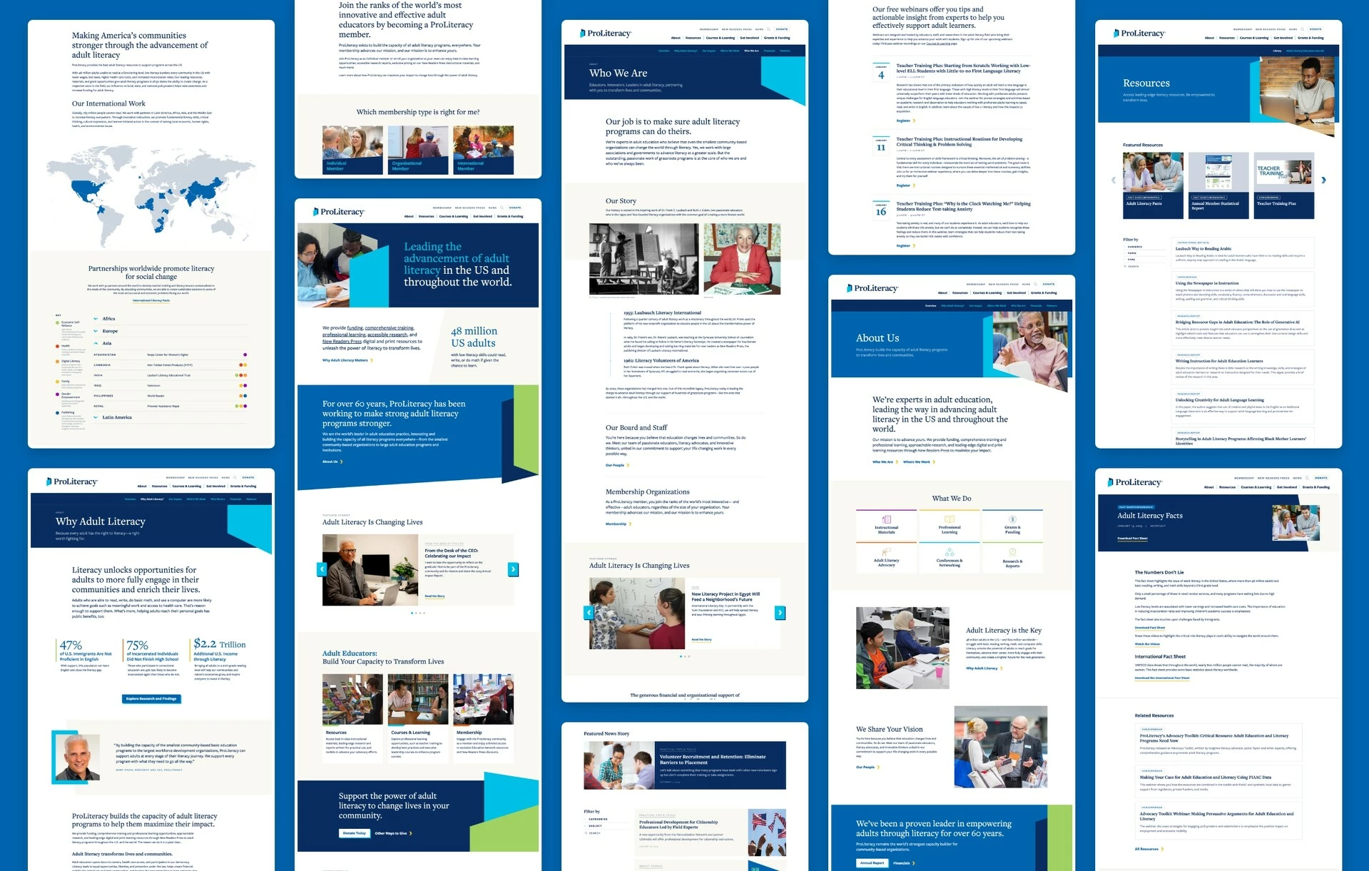
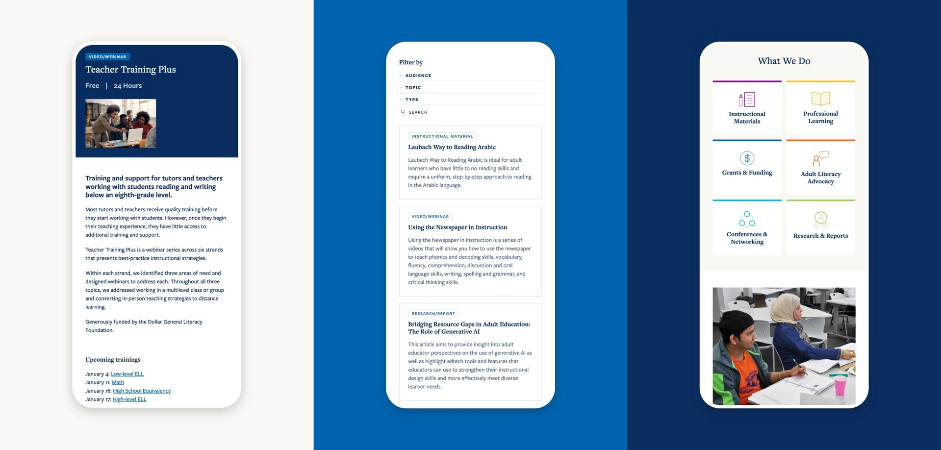
One of the key drivers for the website redesign was to make resources readily available to adult educators and learners. We accomplished this by building a searchable and filterable resource library, listing courses and learning opportunities, creating a member directory with login capabilities, and integrating the publishing division of the organization. Additionally, the redesign successfully met key objectives such as integration with Hubspot marketing and GA4 and compliance with accessibility and privacy standards.


Allison Bleyler McDonald
Senior Director of Marketing, ProLiteracy
Website
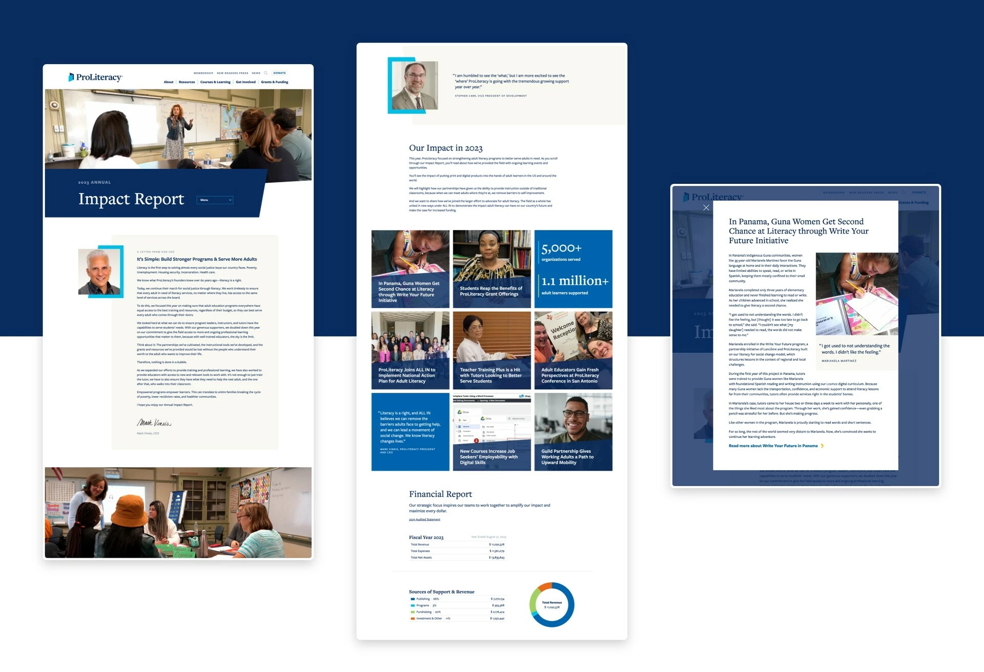
Annual report microsite
We designed a complementary microsite for ProLiteracy’s annual report in alignment with their new branding and website.
