Alford Group
Accelerating the nonprofit community’s impact
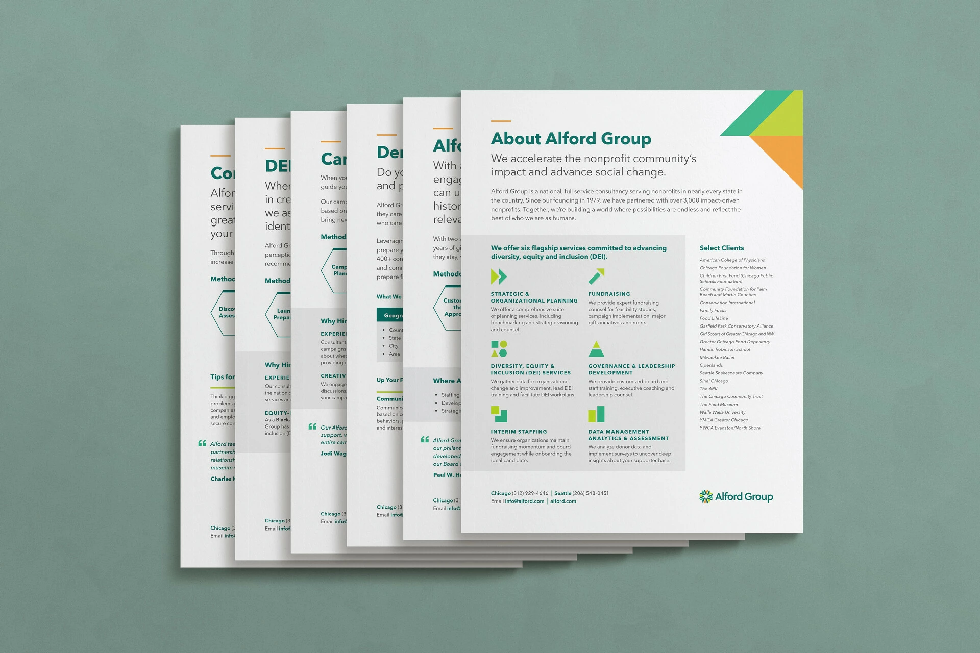
Alford Group is a national, full-service consultancy committed to accelerating the nonprofit community’s impact and advancing social change. They offer six flagship services centered around DEI, fundraising, governance, and organizational strategy.
We partnered with Alford Group to rebrand the organization. We redesigned their logo and visual identity, and revised the language they use to describe themselves and their work. The new brand elements intentionally shift the brand to be bolder and more disruptive.
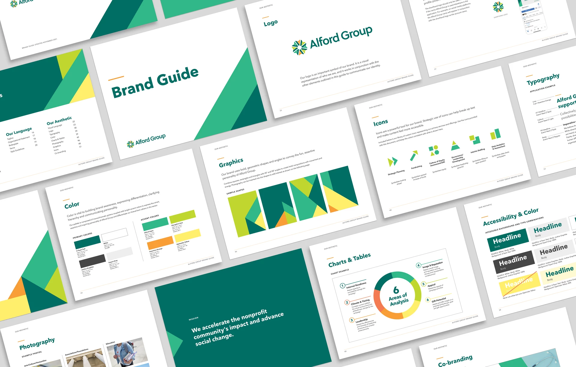
Logo, Visual Identity and Language
Building a bold, inspiring, and professional brand identity
The new language highlights Alford Group’s expertise and clearly communicates how they advise the nonprofit community. Their messaging is approachable yet assertive and reflects their forty plus years of experience as an organization.
In designing the new logo and defining language, we removed “the” from their name—shifting from “The Alford Group” to “Alford Group” in an effort to be more accessible and personal.
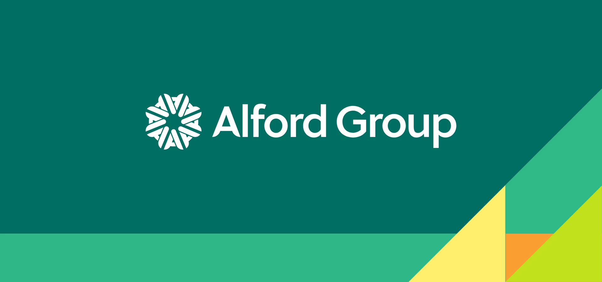
The new logo is inspired by the original logo with a ring of A’s standing for “Alford.” The circular layout communicates collaboration, connections, movement and unity, and multiple colors demonstrate Alford Group’s deep commitment to DEI.
The typography’s rounded geometry communicates the optimistic, approachable nature of Alford Group while its clean lines convey a professional, modern aesthetic. Similarly, the new color palette is bolder, but maintains professionalism in how it’s applied.